
Chart of the Century?
American Enterprise Institute (AEI) Senior Fellow Emeritus Mark J. Perry estimates that over the last fifteen years he has posted some 3,000 infographics to cyberspace—charts, graphs, tables, figures, maps, and Venn diagrams—each serving as his famous “Chart of the Day.” For some of us, Perry’s charts are “eye candy” because of their combination of simplistic beauty and depth of information.
Among those charts, Clemson University Economist and former Federal Trade Commission Chairman Bruce Yandle has a favorite. He liked it so much that he dubbed a previous version “The Chart of the Century” rather than the Chart of the Day.
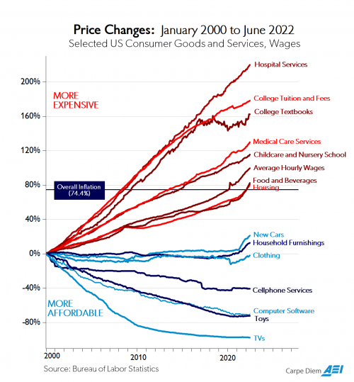
This economic chart has a simple title (“Price Changes”) and a simple design. First, Perry assigns time to the x-axis and uses the y-axis as a measure of inflation.
Then, using data from the Bureau of Labor Statistics (BLS) Perry plots twenty-year trends for fifteen (15) US Consumer Goods and Services and Wages categories.
Here is the latest iteration of the chart (January 2000 – June 2022).

As you review the “Chart of the Century,” consider our interpretation:
The Price Changes (Inflation) graphic is: a) illustrative of what happens when government involves itself with a good or service, and b) one more reason why Palmetto Promise Institute’s Freedom Agenda work in healthcare and education is so important!